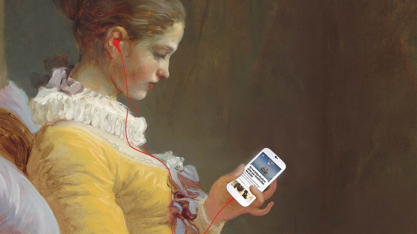
Eight years after creating France’s first 100% web-based media outlet, Rue89 is innovating once again by prioritizing mobile reading, the first step in the redesign of the entire site.

Since Thursday, October 22, 2015, if you’re reading Rue89 on a smartphone or tablet, you can visit the mobile site, which has been redesigned and developed for smaller screens. Entirely in “responsive design” (adaptive website, in good French), it automatically adapts to all screen sizes.
This move to “mobile first” is a reversal of the order followed until now: the site was designed for the computer, and streamed to mobile applications and sites, at the risk of losing a few articles with unsuitable formats along the way.
However, Rue89’s readership on mobile and tablet devices is growing (whether exclusively or as a complement to the computer), as is the case for most media, whether read directly or via social networks. It didn’t make sense to enrich computer reading at the expense of mobile.
Eight years ago, Rue89 had proved that it was possible to produce good journalism adapted to the Web; its objective is now to produce good journalism adapted to mobile.
“Oops, content not adapted”…
And yet, how many times have you seen the announcement appear on your smartphone screen: “Oops! This article has unsuitable content… But you can see it in your mobile browser”?
Annoying, isn’t it? With Rue89, which we’ve been supporting since its inception, we’ve worked to offer the best reading experience, whatever the screen size.
As a result, you’ll now be able to enjoy the excellent “enriched formats” offered on certain articles, even from your phone – and therefore wherever you happen to be reading them.
Changeover in stages
Initially, the “switchover” took place on the mobile site, then we continued the work on the entire website.
Developed by Rue89 from the mock-ups and HTML/CSS integration we produced, the site was rolled out on three “breakpoints”: smartphone, tablet and desktop.